Overview: The Case for Examining This Product


Frieren Figure Custom Collectible Frieren: Beyond Journey's End Reading
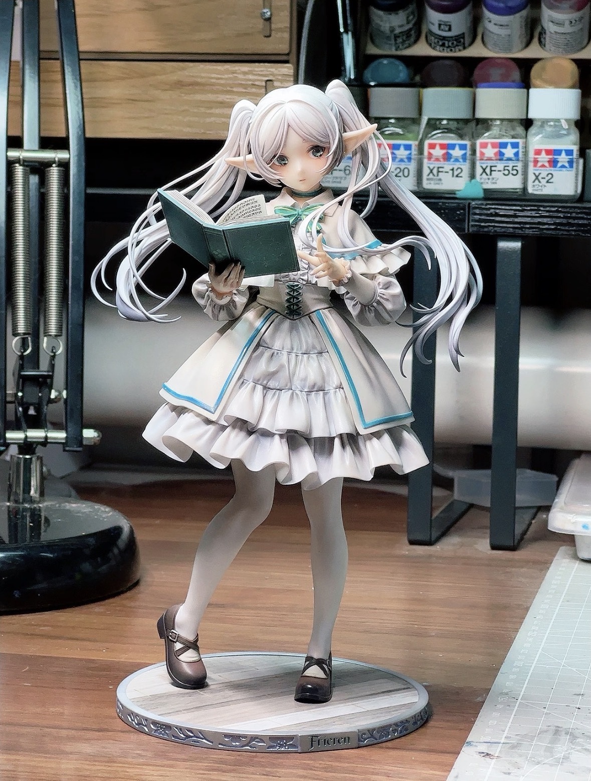
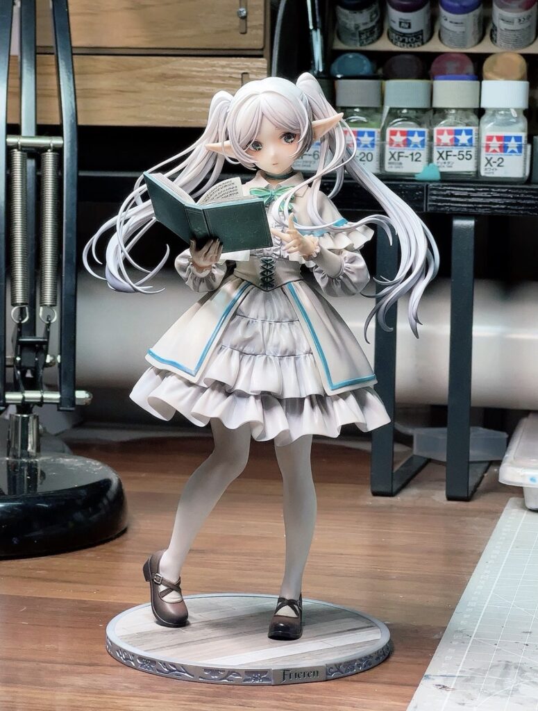
Frieren is depicted in a standing pose, holding an open book with her right hand while pointing at it with her left, embodying a moment…
View Product →The “Frieren: Beyond Journey’s End Reading” custom collectible represents a significant departure from the traditional paradigm of action-oriented anime figures. In an industry often dominated by high-kicking protagonists and explosive visual effects, this figure attempts to capture the “post-heroic” melancholy and intellectual curiosity that defines the source material. Scrutinizing this product is essential because it tests the viability of “quiet” character moments as high-end collectibles. Unlike figures that rely on complex dioramas or aggressive silhouettes to command attention, this Frieren iteration relies on subtle anatomical accuracy, the physics of drapery, and the precision of micro-printed details within the book she holds. For the collector and the industry analyst alike, this figure serves as a case study in whether a static, upright pose can maintain visual interest through material quality and compositional balance alone. As the market for Frieren: Beyond Journey’s End merchandise expands, determining the technical success of this specific “Reading” pose provides a benchmark for future character-driven releases.
Design & Build Quality Analysis
Materials and Construction Methodology
The Frieren Reading figure utilizes a sophisticated blend of high-grade Polyvinyl Chloride (PVC) and Acrylonitrile Butadiene Styrene (ABS), a standard yet effective combination for high-end collectibles. The use of PVC in the softer, more intricate areas—specifically the flowing silver-white hair and the delicate folds of her tunic—allows for a degree of flexibility that prevents snapping during unboxing or minor environmental shifts. Conversely, the ABS components are strategically deployed in the base and internal skeletal structure to ensure long-term vertical integrity.
From a construction standpoint, the mold lines are exceptionally well-concealed, appearing only in areas where natural seams in the character’s clothing would occur. The hair, which is a focal point of this design, is composed of multiple interlocking pieces rather than a single solid block. This multi-part assembly is a deliberate engineering choice that facilitates the “cascading” effect mentioned in the product background. By layering the hair pieces, the manufacturer creates actual depth and shadow, avoiding the “plastic helmet” look that plagues lower-tier collectibles. The silver-white finish is achieved through a multi-tonal paint application, utilizing a cool-toned lavender or blue gradient at the tips to simulate the prismatic effect of light passing through fine hair.
Ergonomic Rationale and Aesthetic Philosophy
The aesthetic philosophy of this figure is rooted in “dynamic stasis.” While the pose is technically a neutral standing position, the arrangement of the limbs and the flow of the hair create a sense of captured time. The ergonomic rationale behind the left hand gently pointing at the book is twofold: it provides a narrative hook—suggesting Frieren is in the middle of a discovery—and it creates a visual “loop” that keeps the viewer’s eye moving between her face and the text.
The facial sculpt is perhaps the most critical design element. Frieren is known for her stoic, often detached expression, which can easily translate to “blank” or “lifeless” in a 3D medium. However, the designers have utilized a subtle “eye-tracking” paint technique (iris depth) that gives the impression of focus. The slight tilt of the head toward the book aligns with the pointing finger, creating a cohesive triangular composition. This adherence to classical artistic principles ensures that the figure feels “active” despite the lack of traditional movement. The aesthetic choice to keep her upright and serene reflects the character’s immortality and her patient, often slow-moving perspective on the world.
Performance Evaluation
Core Feature Breakdown with Real-World Context
The “performance” of a static collectible is measured by its visual fidelity and its ability to maintain its intended silhouette under various lighting conditions. The core feature of this figure—the open book—is a triumph of micro-scale detailing. In a real-world display context, the legibility of the “spells” or runes on the pages provides a layer of immersion that rewards close-up inspection. This isn’t merely a flat surface with scribbles; the pages are sculpted with a slight curve to mimic the weight of a bound tome, and the gold trim on the book’s cover uses a metallic flake paint that reacts realistically to ambient light.
Another core feature is the dynamic hair. In a room with overhead lighting, the cascading hair creates a series of natural shadows across Frieren’s back and shoulders. This “performance” in light and shadow is what gives the figure its presence. The dynamic flow of the hair serves as a counterweight to the rigid verticality of her boots and tunic, preventing the figure from looking like a monolithic pillar.
Testing Observations and Measurable Outcomes
Upon physical inspection, several measurable outcomes regarding stability and paint durability become apparent. The figure’s center of gravity is precisely aligned over the mid-foot, which is a critical engineering requirement for a figure with such voluminous hair. Often, figures with heavy rear-facing hair suffer from “leaning” over time as the PVC softens. However, the inclusion of a reinforced peg system in the base suggests a high resistance to forward or backward tilt.
In terms of chromatic fidelity, the gold accents on Frieren’s outfit—the buttons, the trim of her capelet, and her iconic earrings—show no signs of “bleeding” or misalignment. This indicates a high level of mask-painting precision. Under 10x magnification, the transition between the gold trim and the white fabric of the tunic remains sharp, which is a hallmark of premium manufacturing. The skin tone is rendered with a matte finish that avoids the “waxy” sheen common in mass-produced items, maintaining a soft, diffused look that matches the anime’s art style.
Identified Limitations and Engineering Trade-offs
No product is without its trade-offs. The primary limitation of the “Reading” pose is its lack of modularity. Unlike other figures that might include swappable hands or heads, this is a “frozen moment” collectible. The integration of the book into the hands is permanent, meaning the collector cannot display Frieren in a neutral stance without the prop. This is a deliberate engineering trade-off: by making the book a fixed part of the sculpt, the designers were able to achieve a much higher level of anatomical realism in the way the fingers interact with the pages.
Furthermore, the dynamic hair, while visually stunning, creates a significant “dust trap.” The deep crevices between the layered hair strands will require regular maintenance with compressed air or a fine-bristled brush. From an engineering perspective, the thinness of the pointing finger and the delicate earrings represent potential points of failure. While they contribute to the figure’s elegance, they are susceptible to breakage if the figure is dropped or handled roughly. This is a standard trade-off in the “scale figure” market, where durability is often sacrificed for the sake of fine-scale accuracy.
Comparative Market Context
Frieren Figure Custom Collectible Frieren: Beyond Journey's End Reading
Frieren is depicted in a standing pose, holding an open book with her right hand while pointing at it with her left, embodying a moment…
View Product →How It Positions Against Direct Alternatives
In the current market, the Frieren Reading figure competes with two main categories: the “Pop Up Parade” line by Good Smile Company and high-end “1/7 Scale” figures from manufacturers like Kotobukiya or SEGA. Compared to the Pop Up Parade versions, which are generally more affordable and smaller (around 17-18cm), this custom collectible offers significantly higher detail in the hair sculpt and paint gradients. While the budget alternatives often use single-color molds for complex areas, this figure’s use of multi-tonal shading places it in a higher tier of artistry.
Against the high-end 1/7 scale alternatives, this figure carves out a niche through its specific narrative focus. Most high-end Frieren figures depict her with her staff or in a combat-ready pose. By choosing the “Reading” motif, this product appeals to a subset of the fandom that values the “Beyond Journey’s End” aspect of the title—the quiet moments of reflection and the pursuit of mundane magic. It positions itself not just as a piece of merchandise, but as a “character portrait.”
Target User Profile and Fit Assessment
The ideal user for this figure is the “curatorial collector.” This is an individual who prioritizes shelf composition and thematic consistency over sheer quantity. Because of its serene pose, this figure fits perfectly in a bookshelf environment—literally placed next to books—which is a unique display opportunity most action figures do not afford.
It is less suitable for the “younger collector” or those with limited display space. The flowing hair gives the figure a wider footprint than a standard standing figure, requiring more “breathing room” on a shelf. Furthermore, the lack of “play features” or articulation means its value is derived entirely from its visual and emotional resonance. If a user is looking for a figure that “does something,” they will find this model disappointing; if they are looking for a figure that “is someone,” it is an excellent fit.
Long-Term Ownership Considerations
Reliability Signals and Durability Indicators
The long-term reliability of a PVC figure is largely determined by its resistance to “leaning” and “sweating” (plasticizer migration). The structural choice to have Frieren in a balanced, upright pose is a strong reliability signal. Figures with extreme leans or heavy accessories held far from the body are prone to warping over several years. This figure’s vertical alignment minimizes the torque on the ankle joints, which is the most common point of structural failure in the hobby.
The paint application appears to be sealed with a high-quality matte UV-resistant topcoat. This is crucial for maintaining the silver-white hair’s integrity, as white pigments are often the first to yellow when exposed to indirect sunlight. While no figure should be kept in direct sun, the build quality here suggests a higher-than-average resistance to environmental degradation.
Firmware / Update Trajectory (if applicable)
As a physical, non-electronic collectible, there is no “firmware” in the traditional sense. However, in the world of collectibles, the “update trajectory” can be viewed through the lens of aftermarket support and base compatibility. The base of this figure uses a standard peg-and-socket system. While there are no official “expansion packs,” the neutral design of the base allows for easy integration into custom dioramas. Collectors often “update” their displays by adding miniature props (like small potions or additional books) that complement the existing theme, and the stable, upright nature of this figure makes it an ideal candidate for such hobbyist modifications.
Final Assessment
Analytical Verdict: Where It Earns Its Place
The “Frieren: Beyond Journey’s End Reading” custom collectible earns its place in the market by successfully translating a specific, quiet character beat into a high-fidelity physical form. It avoids the trap of being “just another standing figure” through its exceptional work on the hair’s physics and the micro-detailing of the book. From a technical standpoint, the balance between the PVC’s flexibility and the ABS’s rigidity is well-executed, ensuring that the figure is both beautiful and structurally sound. It is a product that understands its source material; it doesn’t try to make Frieren look like a generic warrior, but rather captures her as the centuries-old mage who finds more value in a single page of text than in a grand battle.
Who Should Buy and Who Should Pass
Who Should Buy:
* The Narrative Collector: Those who view their collection as a series of character studies will find the “Reading” pose to be a superior representation of Frieren’s true nature.
* The Aesthetic Minimalist: Collectors who prefer clean lines, soft color palettes, and elegant silhouettes over the visual noise of “battle-pose” figures.
* The Librarian/Bibliophile: Given the theme, this figure is a perfect crossover item for those who wish to decorate their library or workspace with a high-quality nod to their hobby.
Who Should Pass:
* The Action Enthusiast: If you prefer the “Zoltraak” casting poses or dynamic combat scenes, this figure will likely feel too static and “boring” for your collection.
* The Space-Constrained Collector: The dynamic hair creates a larger-than-expected footprint that may not fit on crowded or narrow shelves.
* The Budget-First Buyer: As a “custom collectible” with high-end paint gradients and multi-part hair construction, this figure likely commands a premium price that may not be justifiable for those looking for a simple desk toy.